
Humans love storytelling. While you may not think this has much to do with your business’s website, the truth is that your website copy can tap into this very human reality and convert more of your visitors into paying customers.
By failing to spend the time and effort necessary to craft effective website copy, you risk losing prospective customers who might just need that extra little nudge to convert. In this article, we’ll talk about how you can ace your website copy and start growing that bottom line.
Define your company’s personality then let it shine through
A key component of building a successful brand is defining your brand’s personality. If your brand was a person, what kinds of adjectives would you want people to use when talking about it? Getting a clear idea of what your brand’s personality is allows you to infuse your website copy with language that reflects this personality, helping your business stand out and stick in people’s minds.
If you aren’t sure what your company’s personality is, it’s well worth it to spend a bit of time working this out. Try this exercise to get started:
- Define your ideal customer. Your brand should, of course, appeal to your target audience, and by getting clear on your ideal customer you can make sure that your brand personality is aligned with their preferences and needs.
- Brainstorm adjectives. Start with as many adjectives as you can think of that define some aspect of your brand’s personality. Then, narrow it down to the absolute best 3 to 5.
- Create a mood board. Although we’re talking about copy and brand voice in this article, visual tools are very helpful for some people. Your mood board can contain any images that reflect your brand personality, and you can refer to this when creating your web copy.
- Create writing guidelines. Explain what your brand should sound like in copy. Provide examples of language that is on-brand, and counter-examples of language that should be avoided.
Once you go through these steps, you’ll be ready to create copy that puts your personality front and center.
Here’s a great example from Toronto web design company Crushing Cones:
They use the header “You have big ideas. We bring them to life” followed by the subhead “The quick — We build and maintain smart design solutions for growing companies.” If you do it right, you don’t need paragraph after paragraph to get your personality across. In a few clear, punchy lines we already get a sense of what this design agency is all about: their company’s personality is savvy, confident, and cool.
Attention to small details, like their unexpected use of “the quick” instead of something like “what we do” or “about us” positions them as anything but boring, while their short, crisp sentences convey confidence in their ability to deliver solutions. This confidence encourages anyone checking out Crushing Cones’ services to feel assured that they can deliver equally sleek, unembellished designs — just like their language.
Compare that to the copy found on the homepage of the perfume brand Kilian.
The language is flowery and ornate, reflecting the brand’s opulent, luxurious personality. “Olfactory intoxicants” is a seductive, enticing way to refer to perfume. For prospective customers who want a perfume that is just as enticing, this copy does an excellent job of making the product seem more irresistible.
Incorporate relevant keywords in a natural way
Keyword research is an important component of SEO, since it helps you identify the phrases that your prospective customers are typing into search engines, enabling you to create content that meets their search intent.
You can start doing your own keyword research with free tools such as Ahrefs’ Keyword Generator. Just type in a keyword related to your business, and you’ll generate a bunch of related keywords that can guide your content creation.
For example, if you have an interior design business and type “furniture” into the Keyword Generator, you’ll see that one of the results is “patio furniture”. Since people out there are searching for this, you can work the keyword “patio furniture” into your web copy on the page where you sell these items in order to climb the SERPs for that search term.
What does “natural” mean in this case?
In short, it means avoiding keyword stuffing. You don’t need to throw the term “patio furniture” into every other sentence to effectively incorporate it into your copy and increase your chances of being discovered by people entering this search term into Google. Instead, use it in a few headings, throughout your copy wherever it would naturally make sense in speech, and in extra locations such as image descriptions.
For example, check out this service page from the business management software company Timely.
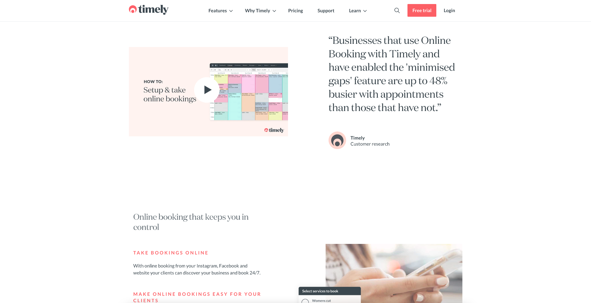
They use the terms “online booking and “bookings online” throughout the page, but you never feel that it’s being repeated in an unnatural way. It can be found in headings and in body copy, as well as in the image file names.
The result? Not only will prospects be likely to find this page through search engines but, once they’re on the page, the key function of the software is being reiterated, keeping them focused and nudging them towards a conversion.
Never forget to include a convincing call to action
It’s easy to overlook the importance of a good call to action: when you’re writing your website copy, the desired action feels obvious. However, for your website visitors, it’s important to clearly invite them to take the next step, whether that’s adding a product to their cart or booking a consultation.
The internet is a busy and distracting environment, so it’s essential that your CTAs cut through the noise and make it super clear to your visitors what you’d like them to do next. You should have a great CTA on your homepage, landing pages, product pages, and anywhere else appropriate.
To make your CTA stand out, keep these tips in mind:
- Make your CTA stand out visually with different text, distinct colors or other design elements that make it unmissable
- Keep your CTA short and to the point. This isn’t generally the place to use flowery language.
- Be super clear about what the desired action is.
- Use an appropriate CTA for the point in the customer journey.
Here’s an example from OGO Print-on-Demand that demonstrates a clear, effective CTA that is well-suited for customers early in their journeys:
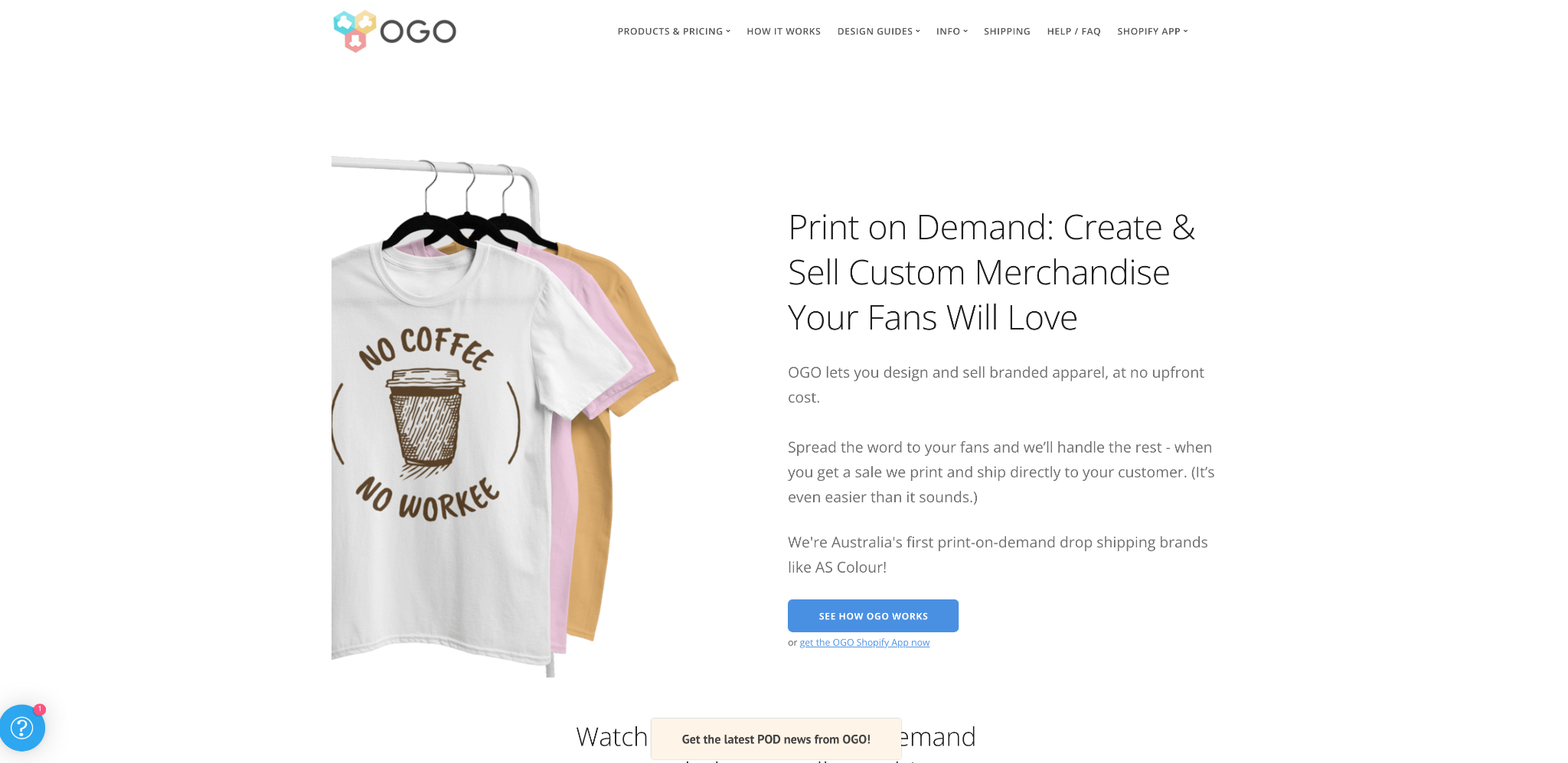
Someone landing on this page may not quite be ready to sign up for OGO, so they are using a CTA that is more likely to get results and move the prospect closer to converting. The action here is low-stakes – see how OGO works – rather than something like “sign up now”, which may not resonate with users at this stage of the funnel. As a result, it’s far more likely to get clicks.
Sometimes, it can even be effective to have multiple CTAs on one page, like in this example from DocMJ Medical Marijuana Doctors.
Having two CTAs — here, “Book Appointment” and “Do I Qualify” means that prospects who already know they qualify can go ahead and book an appointment, while those who aren’t sure can take the next steps to determine their eligibility. This way, DocMJ doesn’t lose either prospect due to there not being an appropriate CTA for them. If you have landing pages on which people at different stages of your funnel might land, consider having multiple CTAs to cover your bases, too. It’s worth noting that the text “Do I qualify?” isn’t itself strictly a call to action, but its placement on a button next to the “Book Appointment” button makes it effectively function as one for anyone landing on this page.
Ensure your copy tells customers exactly what they can expect from you
You know your product or service inside and out, so it’s easy to forget that your customers might not. A lot of businesses fall short when it comes to ensuring their customers understand exactly what they’re going to get if they do business with you.
Important expectation-setting information to convey includes things like:
- Ensuring they have a realistic timeline of how you typically work
- Understanding in which exact areas your business can help them
- Knowing who your products or services are designed for
For example, check out this copy from personal finance blog Don’t Work Another Day.
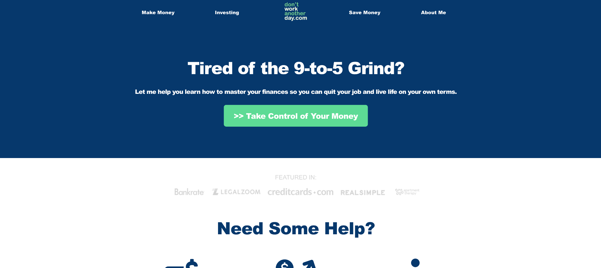
The copy makes it easy to identify who this website is for: anyone unhappy in the 9-5 grind. If that’s you and you land on this page, you know the content will be for you. Next, the value to the reader is articulated: they will learn how to master their finances so they can quit that 9-5. Perfect! The copy on this page makes it very easy to understand what you’re going to get so that you can determine if you want to keep reading.
Stating the prospect’s problem, followed by the solution you offer, is a tried and true formula to repeat on your own website.
In some cases, it might make sense to get more detailed, like in this example from the insurance company Zensurance.
Anyone interested in an insurance quote is likely to have the same range of questions about what each type of insurance covers. So, by answering these questions for all the most common types of insurance, Zensurance lets customers quickly identify which type is going to be best for them.
By providing detailed information like this, you can give your prospects the information they need to take action and convert, without the added friction of having to do more research.
Always focus on benefits over features
Another common mistake people make on their websites is speaking about features rather than benefits. Instead, put yourself in your customer’s position. Customers will always be more interested in how a product or service will benefit them rather than what features it has. The features may lead to a benefit, but try to use language that draws attention to how the customer’s life is made better by your offering.
Making little tweaks to your copy can make a huge impact on your conversions, and this is one of those situations.
Go through your existing copy and make sure that, before you get into the features, pricing, and other information about your product or service, you dive right into the benefit to your customer.
These are things like:
- How your product or service will save them time
- How it will help them get the results they desire
- How it will help them make or save money
Check out how business verification platform Cobalt Intelligence aces this strategy.
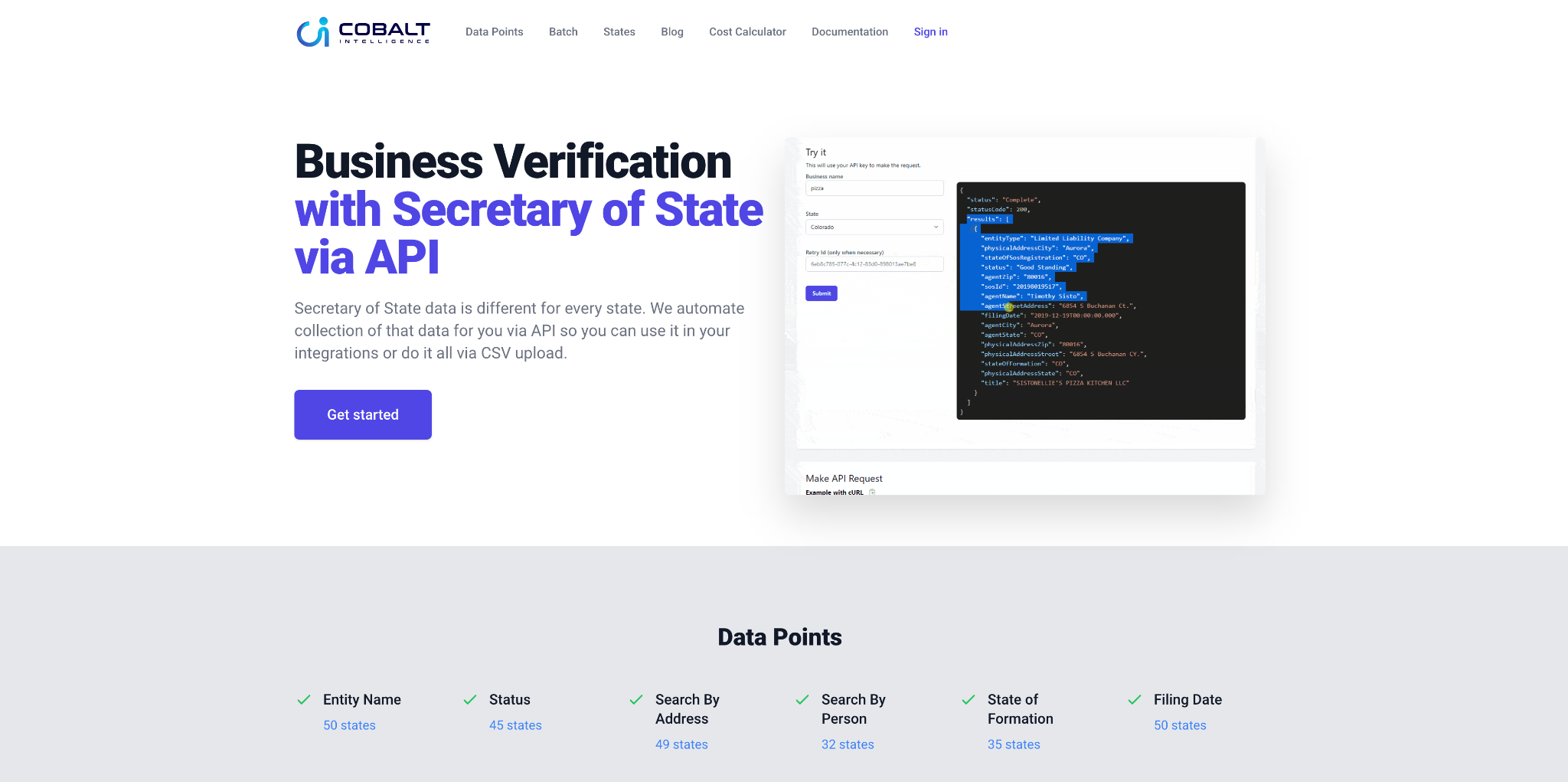
Their users don’t need to know the features of their product right away. What they do need to know is what it can do for them.
And the company provides this information upfront: Cobalt Intelligence automates the collection of data for business verification in every state. Features are then listed below, which can also benefit customers who are ready to dig into the specifics of the platform, but it’s important to lead with the benefits. This is what they care about most.
Cash-back platform Rakuten also shows how it’s done here.
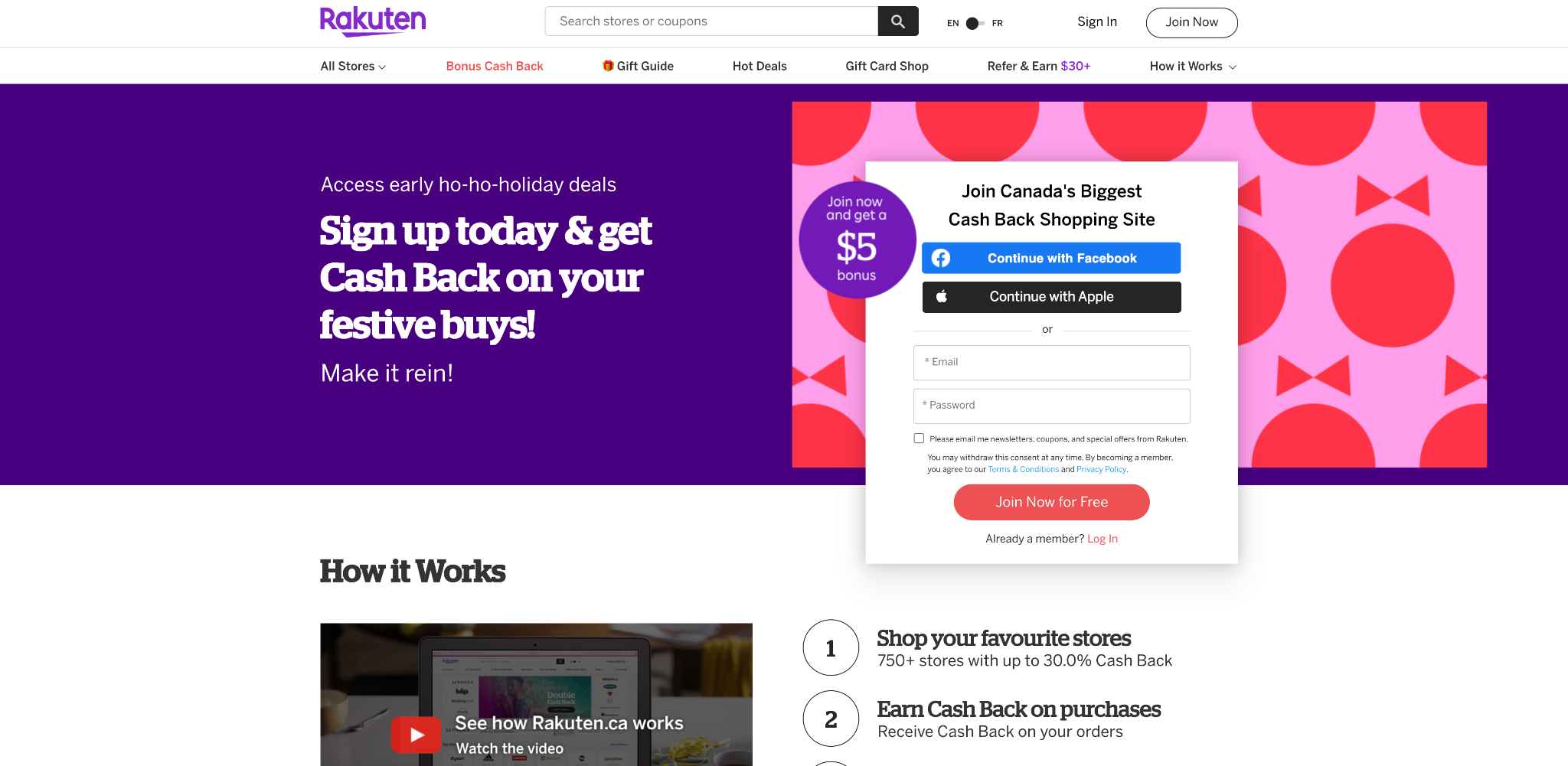
Users can scroll down the page to see the “How it Works” section where they can learn about the features of the platform, but the first information they see in the hero section is the invitation to “get cash back on your festive buys”. In other words, Rakuten leads with the benefit to the customer rather than the features.
All it takes is a simple audit of your website to spot the places where you talk about features. When you see those, make sure you first introduce the benefits of them to your customer. You don’t have to remove the information, though; rather, restructure your copy a little bit for better conversions.
Final thoughts
Whether you’re writing for your website or an app, copy has enormous power to drive your prospects toward a conversion. With the tips we talked about in this article, you can put language to work to grow your business’s bottom line.
–
Author bio & headshot:
Aaron Haynes is an entrepreneur, digital marketing enthusiast, and occasional SEO writer. With more than a decade of experience in business development, Aaron helps businesses and agencies develop and grow a data-driven yet nimble approach to search engine control. You can find more from Aaron on Twitter and LinkedIn.


0 thoughts on “5 expert tips for writing excellent website copy that will win you more customers”